It's been well known by legendary painters and artists how to evoke emotion through their choice of colors. These same color theory principles are now applied in the modern world for purposes of business and marketing. With web design, the choice of colors can have a huge impact on how visitors to your site feel, perceive your brand and interact with the website.
While there are entire books filled with information about color theory, let's break down some of the most important parts as they relate to web design. These quick tips will help give a better understanding of how to design with human psychology in mind and further optimize your website.
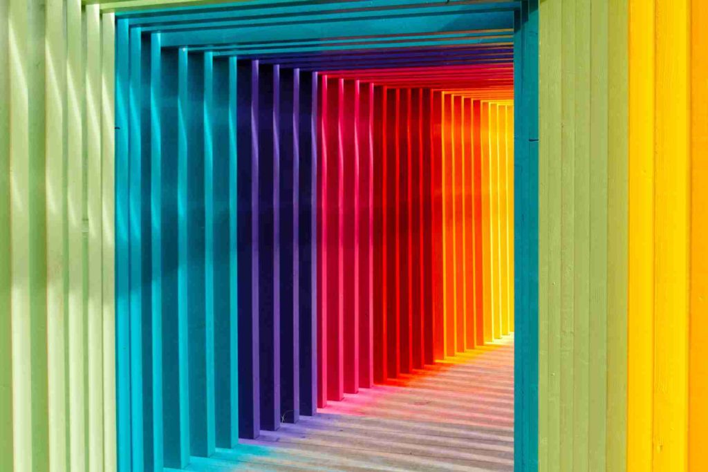
Each color can make visitors to a site feel a certain way. With marketing, it's very important that we have control over how we want our audience to feel. We want to make people believe in the brand, and to control the way they perceive it. We want people to take some specific action. Let's go over the different emotions that can be reinforced using different colors, an important part of color theory in web design.
Red is a color that can be associated with a wide variety of emotions. It's tied to feelings of love and desire, but also feelings of anger and danger. Red can communicate importance, like when it's used for a red carpet at celebrity events. When red is used in a design, it gives off feelings of power.
The shade of red can change the emotion it causes in visitors to a website. Brighter shades of red are more energetic, and darker shades are more tied to the perception of importance. Red is a very versatile color, depending on the shade being used and the context.
We've used red in our design to communicate importance and youthfulness. Since we focus on building websites to a modern standard and with modern aesthetics, the use of the color is appropriate for our messaging.
Orange is another very vibrant and energetic color. It can be used to communicate creativity and uniqueness. Orange can help promote some of the same feelings as red and command attention in a similar way, but it's generally less in your face, and more muted and subtle.
Muted shades of orange can be associated with nature, since it's a color we see in nature, particularly in autumn.
Yellow is also an energetic color, but it's much more subdued than red. It's associated with positive emotions, such as enthusiasm and happiness, largely due to it being the color of sunshine. Yellow is sometimes associated with danger, although this effect is smaller than red.
Darker shades of yellow, like gold, can be associated with feelings of wisdom and timelessness.
Green is a calming color that is often used to promote feelings of stability and growth. It's often used in financial and environmental designs. Brighter greens are better used for designs revolving around nature, and darker greens are generally used to display wealth or affluence.
Another calming color, blue promotes feelings of relaxation and safety. Like the other colors, its meaning changes depending on the shade. Light shades of blue seem friendly and open, and darker shades seem more somber and serious.
You'll notice blue used on social media sites like Facebook and Twitter, as they take advantage of the feelings of openness blue can cause. This is in contrast to more business orientated corporate websites, as they try to give the impression of reliability and strength.
Purple has always been associated with royalty. Darker shades tend to give off the impression of luxury and wealth due to this association with royalty. Purple can also be a romantic color when used in a lighter shade.
This is another color we've used in our color scheme. The background for our contact form on the homepage of this site is a dark shade of purple.
Black is a neutral color that can be associated with many different emotions. Positive emotions tied to black include formality, power, and sophistication, similar to purple, but on the negative side, it can be tied to death or evil.
Black can be elegant and conservative, or edgy and modern, depending on the context of other colors used in the design.
White is another neutral color. Generally white promotes feelings of simplicity, cleanliness, and innocence. White draws little attention to itself, allowing the other colors used in the design to draw in more attention. It's a neutral color that can be used as a backdrop, letting the other colors speak the loudest.
Gray is a somewhat versatile color. It can be used in place of white in lighter shades for some designs, having the same effect as a neutral backdrop. In darker shades, it can be used in place of black. It can also be associated with feelings of depression and melancholy in some contexts.
Gray backgrounds are often used to portray feelings of modernism, sophistication, formality, and professionalism. Often hints of other colors are mixed in with gray and used as a backdrop in web designs, as well as using shades of gray for text instead of pure black or white.
Brown is normally associated with the Earth and nature. It can be a dull color, but can also be tied to feelings of dependability and reliability. It can bring warmth and wholesomeness to a website's design, and can also be used in darker shades in place of black.
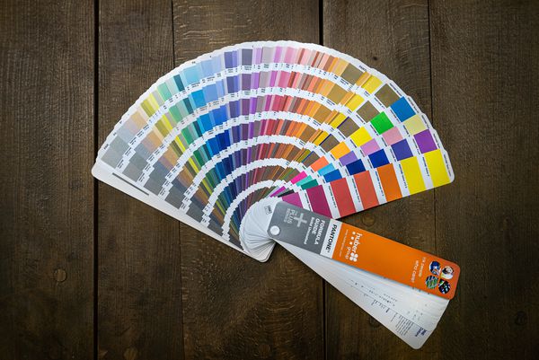
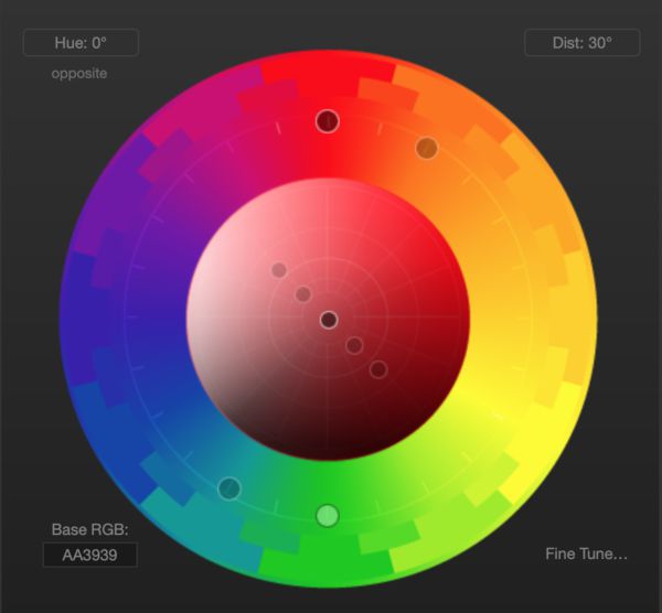
Color theory can help to pick different colors that will look good together. By picking colors from the color wheel systematically, you'll end up with a color palette that looks great. One tool that can help with this is Paletton.
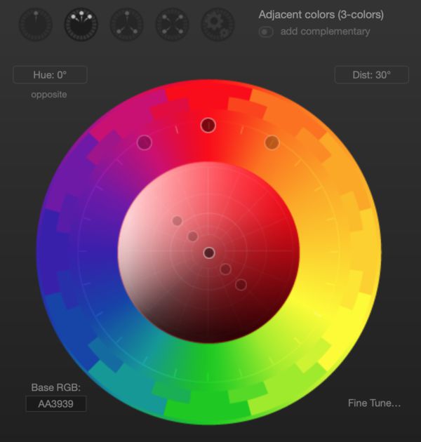
By picking three colors evenly spaced from each other on the color wheel, you'll end up with one primary color, and two secondary colors that compliment it well. You can experiment with this, keeping in mind the emotions each color evokes to quickly create a simple color scheme.
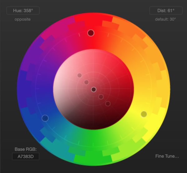
This is another simple color scheme structure, similar to the adjacent color scheme mentioned above. This one focuses on picking more contrasting colors, generally 120 degrees apart on the color wheel.
This one throws a fourth color into the mix, using two sets of complementary colors. Each primary color has a contrasting secondary color to go with it. This is sometimes known as split complementary colors.
Basic color theory is easy to learn, and can drastically improve any kind of design, and web design is no exception. By putting some thought into color choices, you can make sure your website communicates what the brand is all about, and promote the right kinds of feelings in your visitors.