With the modern internet, it's practically essential to have a mobile version of your website. Gone are the days where most people use the Internet from a desktop computer and websites can get away with a fixed layout. Instead, responsive web design is today's standard.
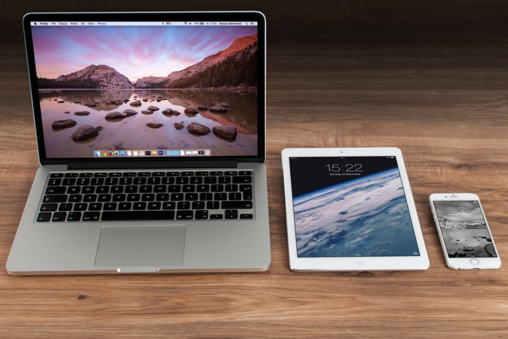
Smartphones have taken the world over, and more than half of all traffic on the internet now comes from mobile devices. With responsive design, your website will look great on any sort of device. Whether someone's on a desktop, laptop, smartphone, or tablet, your layout can adjust to perfectly fit their screen.
Responsive design is the modern approach to designing a website's layout. Using techniques such as flexible sized images, grid layouts, and CSS media queries, elements on your page can resize and be repositioned dynamically based on the user's device.
Using responsive design, there's no need to build a separate mobile version of the site or make updates when the latest shiny gadget comes out. Your website is designed from the beginning with the expectation that any imaginable screen size should be able to use it.
Responsive design uses a number of CSS based techniques to ensure your website looks great no matter the screen resolution or what sort of device is being used, Let's go into detail about some of these techniques.
For a responsive website, this tag needs to be added to the <head> tag of each page.
<meta name="viewport" content="width=device-width">This has no effect on the desktop version of the layout, but for mobile devices, it instructs the browser to set the page's width to match the device's width. Without this meta tag, the browser will resize the page to match the desktop layout, making everything small and requiring users to zoom in to use the page.
We can look at Google's example to see this meta tag in action:
Here's a page without meta viewport set, viewed on a mobile device.
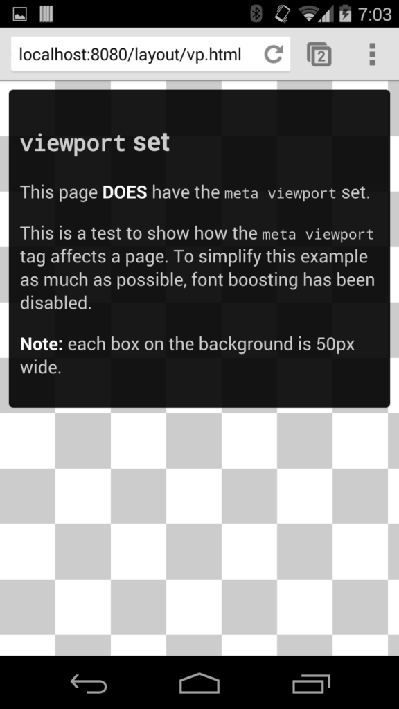
Without the viewport tag set, the content appears smaller and hard to read.

In a responsively designed website, it's important that any larger images don't have a fixed pixel width. That's because mobile devices have smaller screens with smaller effective resolutions. Images need to fit within the screen's width and height, no matter how big the screen is.
Let's take a look at this CSS snippet:
.img-responsive {
  width: 100%;
  height: auto;
}
When added to images, this CSS class will them responsive. It says that the width of the image should match the container, and its height should be calculated to maintain the aspect ratio and prevent stretching.
Media queries are a fundamental part of responsive web design. Beginning in 2012, the W3C started to recommend browsers to implement support for media queries. Today, every web browser has supported media queries for years, and they're an essential part of CSS.
Check out this simple example to learn how media queries work.
<html>
  <meta name="viewport" content="width=device-width, initial-scale=1">
  <head>
    <style>
      .column {
       box-sizing: border-box;
       display: inline-block;
       padding: 10px;
       width: calc(50% - 20px);
      }

      @media(max-width: 699px) {
        .column {
          width: 100%;
          padding: 10px 0;
        }
      }

      .first-column {
        background: #eee;
      }

      .second-column {
        background: #eeaaae;
      }
    </style>
  </head>
  <body>
    <div class="row">
      <div class="column first-column">
        <p>Hello media queries!</p>
      </div>
      <div class="column second-column">
        <p>Responsive design is fun!</p>
      </div>
    </div>
  </body>
</html>
This is a simple two-column grid layout built with media queries. On devices under 700px in width, the layout collapses down to a single column. Here's how it looks.
Desktop layout:

Mobile layout:
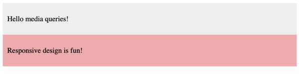
These columns can now support larger blocks of text, and they won't become too narrow and awkward to read on smaller devices. This is just a simple example of what media queries can do.
With media queries, you can adjust any CSS property you want, fully customizing the layout any way you want. You can add additional breakpoints so devices of any width have their own special styles.
Responsive web design is essential for any website today. Without it, you may lose more than half of your potential visitors if they can't easily use your website. Google rewards mobile-friendly websites, so without it, mobile users may never find your site.
At Bidwell Websites, we take mobile devices into consideration from the beginning. If you'd like to bring your website into the 21st century, please feel free to reach out, and we'll come up with a plan that meets your business's specific needs.